Table of Contents
- Why Wall Color + Lighting = Pure Magic
- The Color Temperature Game-Changer
- White Walls: The Blank Canvas That's Anything But Boring
- Beige & Cream: Making "Safe" Look Sophisticated
- Gray Walls: From Cold to Cozy in Seconds
- Bold Colors: Navy, Forest Green, and Other Statement Makers
- Pastels: Soft Colors That Deserve Soft Light
- Color Combinations That Never Fail
- Beyond the Basics: Advanced Poplight Strategies
- The Bottom Line: Your Walls Deserve Better
- FAQs
Your walls are screaming "pick me!" but your lighting is playing it safe. Sound familiar? Here's the thing: that gorgeous paint color you spent three weekends debating? It's only as good as the light hitting it. And those renter-friendly sconces you've been eyeing? They could be the secret to making your wall color look like a million bucks.
Welcome to your crash course on pairing Poplight with every wall color imaginable—because life's too short for lighting that doesn't make your space look incredible.
Why Wall Color + Lighting = Pure Magic
Let's start with the basics.
Your wall color and lighting work together like the perfect duo. Think peanut butter and jelly, but for your home. The right renter-friendly sconces can make a beige wall look warm and sophisticated, or turn a bold navy into the coziest reading nook you've ever seen.
But here's what most people get wrong: they pick their lighting as an afterthought. They paint their walls, arrange their furniture, and then... grab whatever lamp is on sale at Target.
That's like buying the perfect outfit and pairing it with flip-flops. It works, but it's not working.
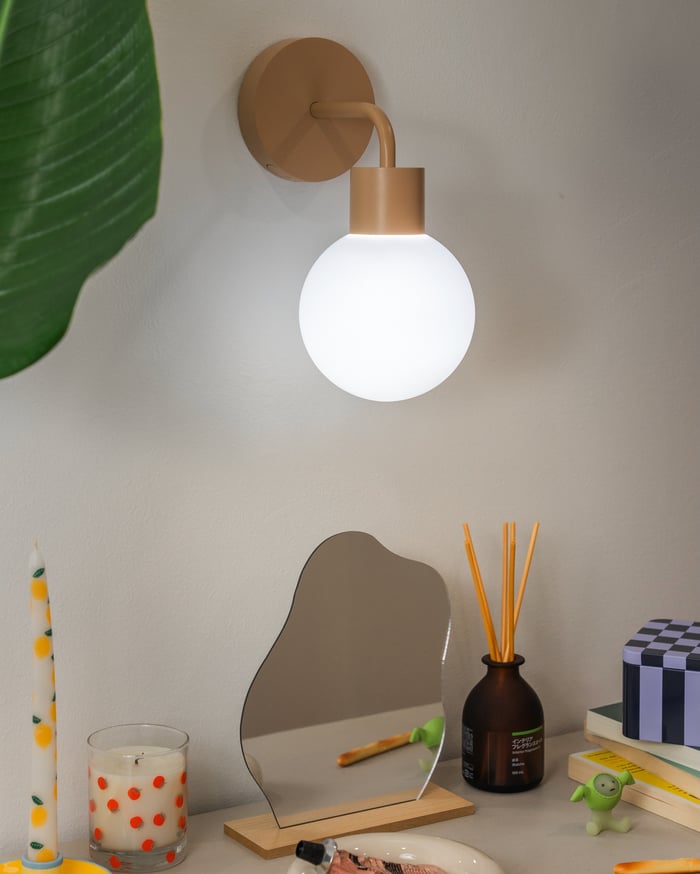
 Modern side table set illuminated with Poplight mushroom wall light sconce and other minimalist decor.
The Color Temperature Game-Changer
Before we dive into specific wall colors, let's talk about Poplight's secret weapon: customizable color temperatures.
Poplight isn't just one type of light — it's three:
- Warm (2700K): That golden, cozy glow perfect for winding down
- Neutral (3000K): Clean and crisp without being harsh
- Cool (4000K): Bright and energizing for when you need to get stuff done
This means one set of renter-friendly sconces can completely transform how your wall color looks throughout the day. Mind = blown.
White Walls: The Blank Canvas That's Anything But Boring
White walls get a bad rap for being "basic," but they're actually the most versatile backdrop for your Poplight game.
The Perfect Pairing:
- Morning: Cool light (4000K) makes crisp whites feel fresh and energizing
- Evening: Warm light (2700K) adds depth and prevents that sterile, gallery-wall feeling
- Pro tip: Use neutral light (3000K) during the day for the perfect balance
Poplight Color Recommendation: Matte Black Poplight creates stunning contrast against white walls, adding visual interest and a modern edge. The black fixture becomes a statement piece, while the light creates beautiful wall washes.
White walls with renter-friendly sconces are like a little black dress—classic, versatile, and always looking put-together.
Beige & Cream: Making "Safe" Look Sophisticated
Ah, beige. The color every landlord loves and every renter tolerates. But here's the plot twist: beige walls + the right lighting = pure sophistication.
🔆 The Magic Formula: Warm light (2700K) is your best friend here. It brings out the golden undertones in beige and cream walls, making them feel intentional and luxurious instead of... well, like landlord special.
✅ Poplight Color Recommendation: White Poplight blends seamlessly with beige and cream walls, creating a cohesive, elevated look. The white fixture won't compete with your wall color but will add that designer touch you're after.
Styling Tip: Place your Poplight at different heights to create layers of warm light. One near your headboard, another highlighting artwork, maybe a third in that awkward corner that never gets love.
Gray Walls: From Cold to Cozy in Seconds
Gray walls can go one of two ways: modern and chic, or cold and uninviting. The difference? You guessed it—lighting.
For Warm Grays: Stick with warm light (2700K) to enhance those subtle beige undertones and keep things cozy.
For Cool Grays: Here's where you can play around. Neutral light (3000K) keeps things crisp and modern, while warm light (2700K) adds unexpected coziness to cooler tones.
Poplight Color Recommendation: Both White and Matte Black Poplights work beautifully with gray walls. Choose white for a softer, integrated look, or go with matte black for bold contrast and modern sophistication.
Bold Colors: Navy, Forest Green, and Other Statement Makers
So you went bold with your accent wall? Good for you. Now let's make sure your renter-friendly sconces do it justice.
✴ Dark blues like navy and midnight feel sophisticated, not somber, with warm 2700K light. Pair white Poplight sconces for a striking nautical contrast that enhances the depth of deep blue walls.
✴ Deep greens (forest, hunter) shine with warm 2700K-3000K light—avoid cool tones that can make them look muddy. Matte black Poplight sconces add a moody, refined contrast against rich green walls.
✴ Rich purples & jewel tones glow under warm light—white Poplight sconces add elegant contrast, letting the bold wall color shine.
Matte Black Poplight

$99.00
Rechargeable, stick on wall lighting ⏱ Instant Installation: Stick on in seconds—no tools needed! Transform any space with Poplight's effortless setup. 👉 Customizable Lighting: Enjoy perfect ambiance with dimmable settings and three color temperatures to match any mood or occasion. Simply… read more
Pastels: Soft Colors That Deserve Soft Light
Blush pink, sage green, powder blue—pastel walls are having a major moment, and for good reason. They're calming, pretty, and Instagram-worthy.
The Rule: Soft colors deserve soft light. Stick with warm (2700K) or neutral (3000K) temperatures. Cool light can wash out pastels and make them look... well, like a nursery.
Poplight Color Recommendation: White Poplight is perfect for pastel walls. It maintains the soft, dreamy aesthetic while providing gentle illumination that enhances rather than competes with delicate colors.
Poplight Placement Tip: Try placing your renter-friendly sconces to graze the wall rather than directly illuminating it. This creates a subtle wash of light that makes pastel colors glow.
Color Combinations That Never Fail
✅ White walls + Matte Black Poplight: Classic contrast that works in any style
✅ Gray walls + White Poplight: Clean and modern without being cold
✅ Navy walls + White Poplight: Nautical vibes that feel sophisticated, not themed
✅ Beige walls + Black Poplight: Adds visual interest to neutral spaces
Beyond the Basics: Advanced Poplight Strategies
Create Depth: Use multiple renter-friendly sconces at different heights to add visual layersHighlight Texture: Graze textured walls with your Poplight to show off interesting paint techniques or wallpaperZone Your Space: Use different light settings in different areas of the same room to create distinct zones
The Bottom Line: Your Walls Deserve Better
You've spent time (and probably way too much money) making your rental feel like home. Your walls deserve lighting that makes them look their absolute best.
Renter-friendly sconces like Poplight aren't just about convenience — they're about finally having control over your space's vibe. No more waiting for permission, no more living with landlord lighting, no more settling for "good enough."
Your perfect wall color is already there. Now give it the lighting it deserves.


 Rated 4.8 based on 100+ reviews
